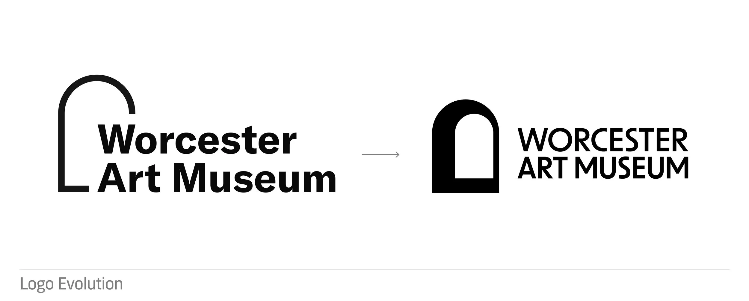
Worcester Art Museum – Self-Initiated Brand Identity Concept

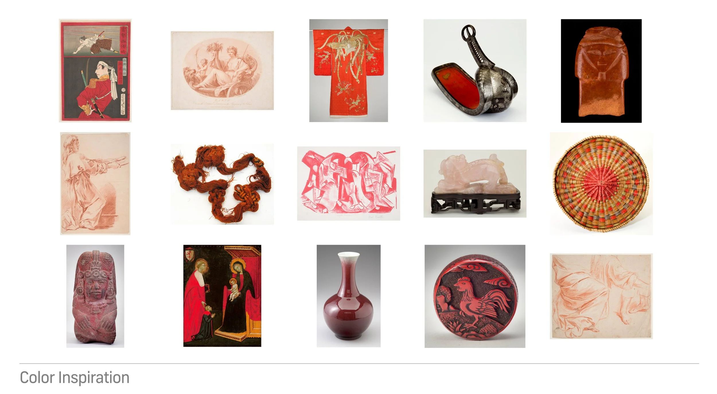
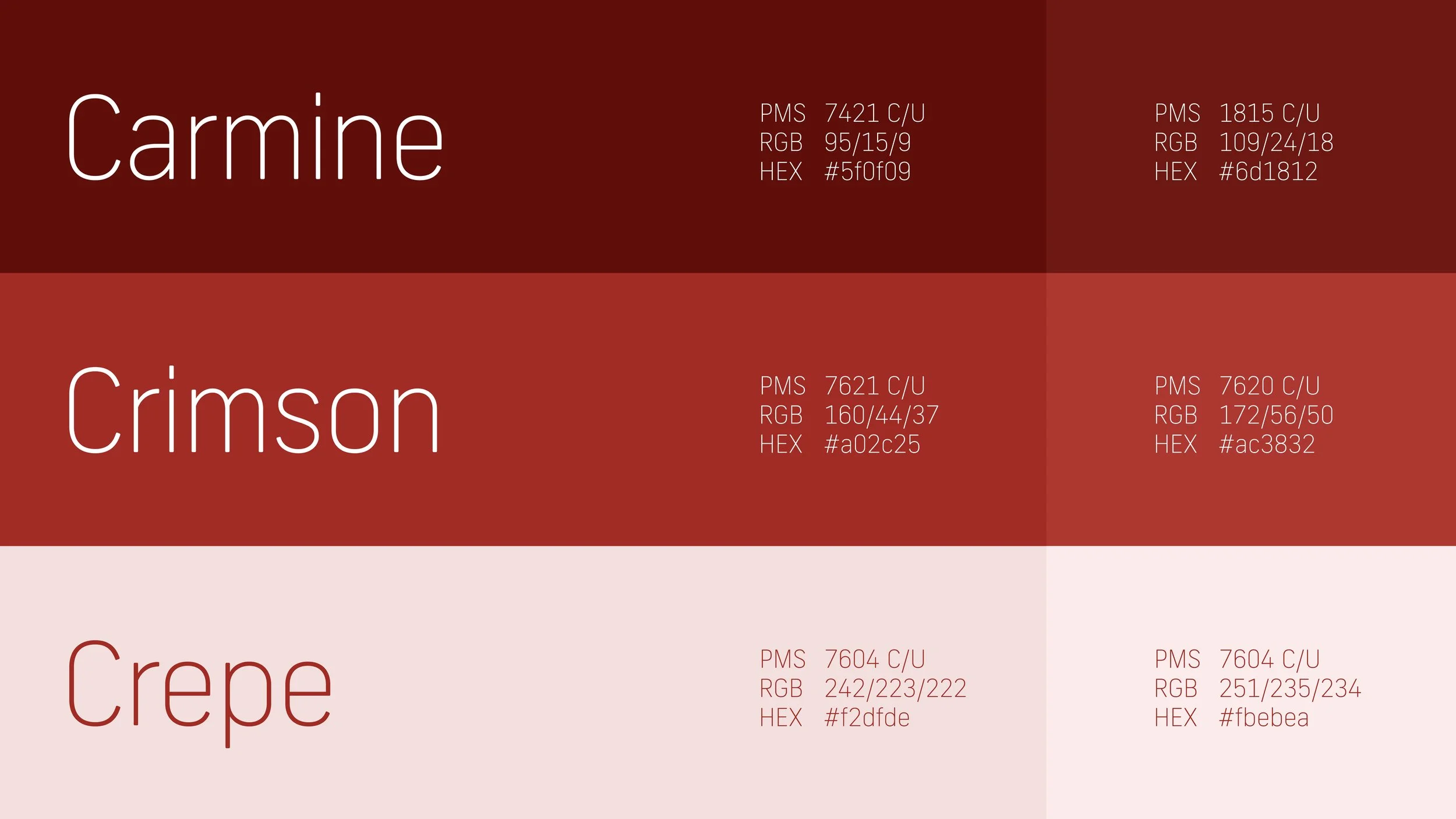
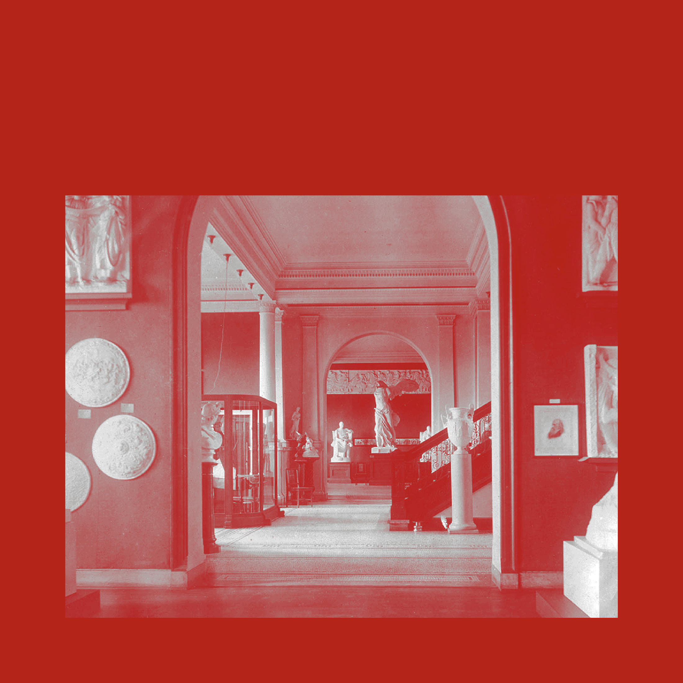
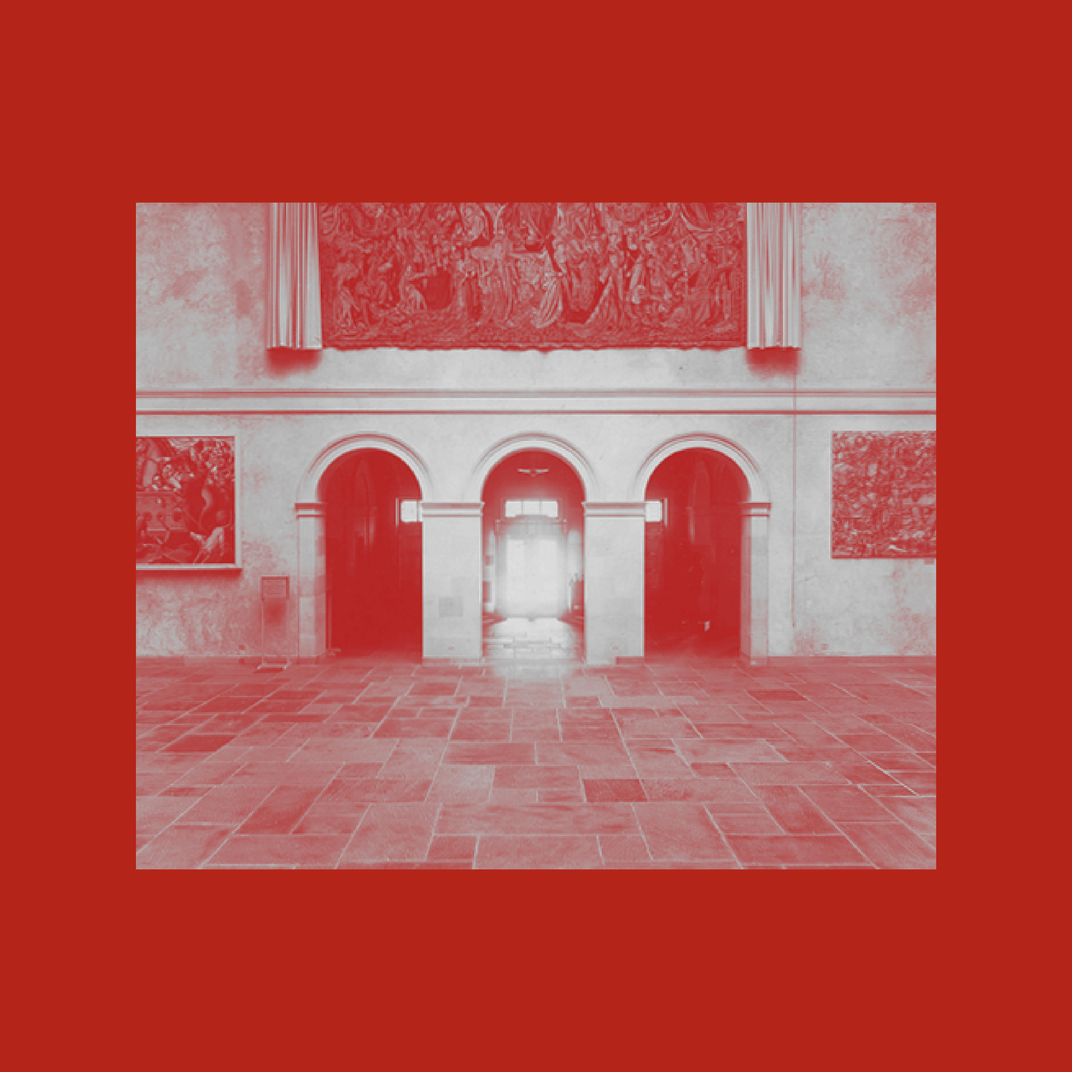
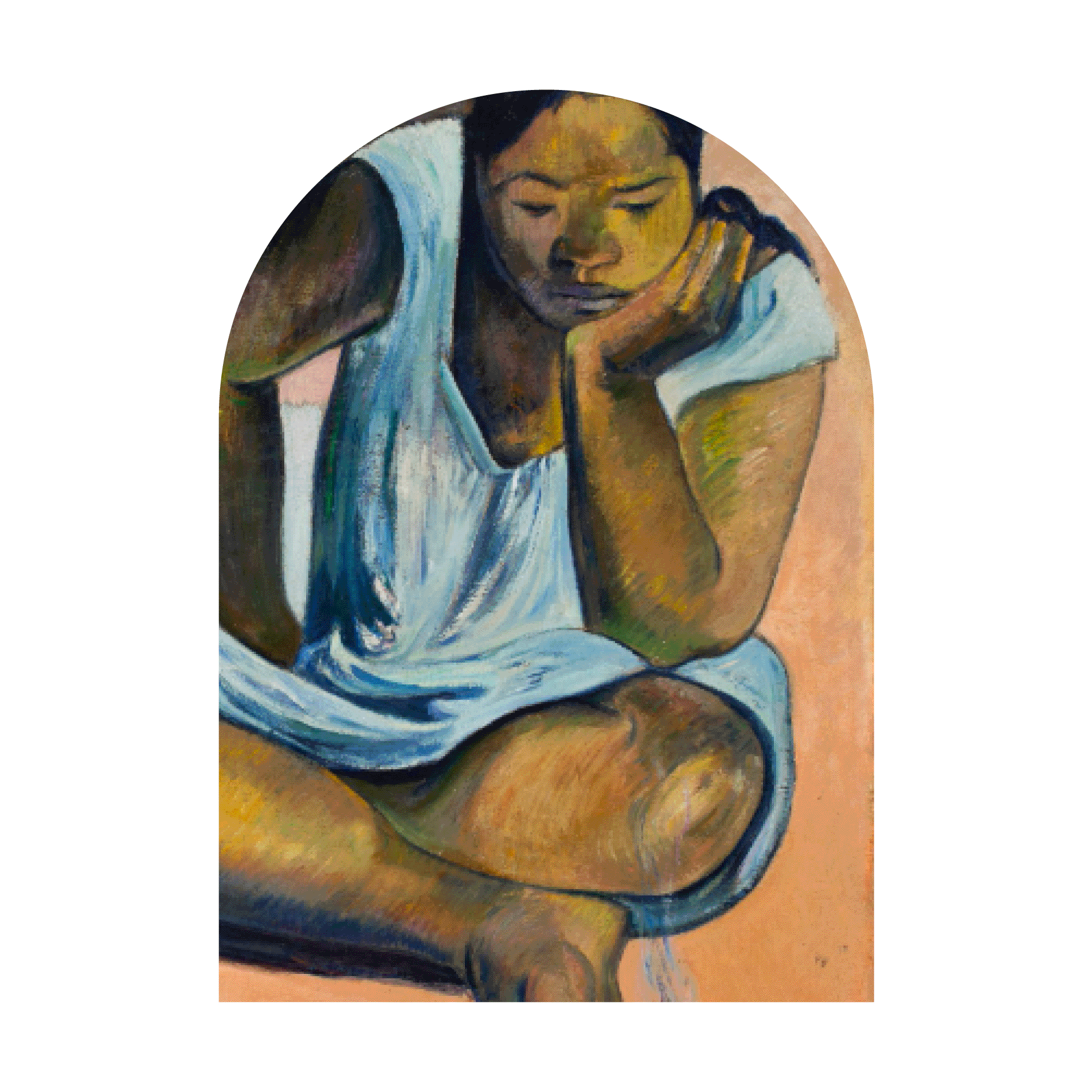
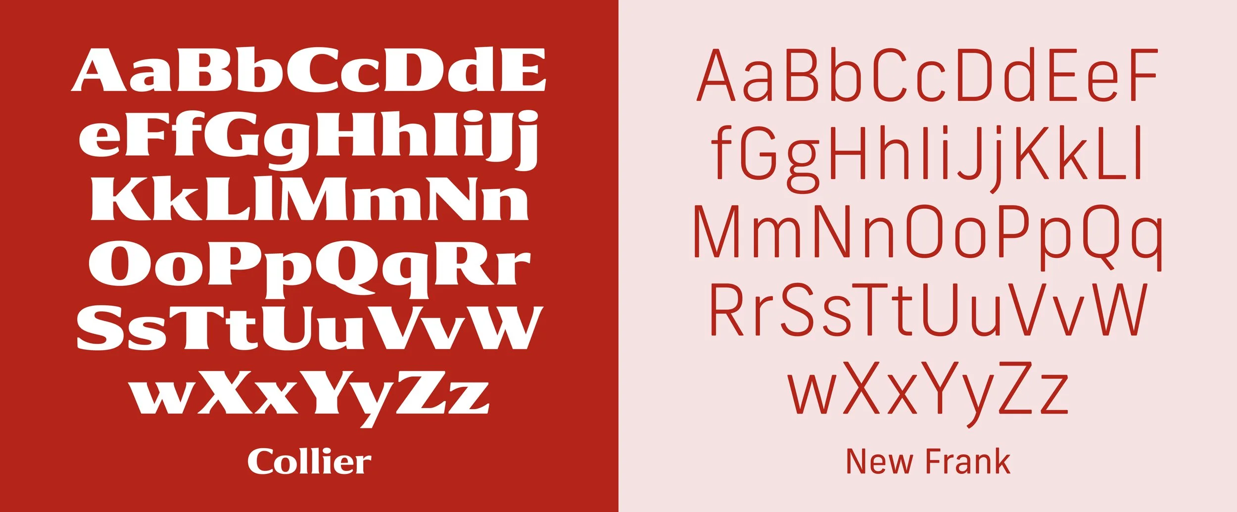
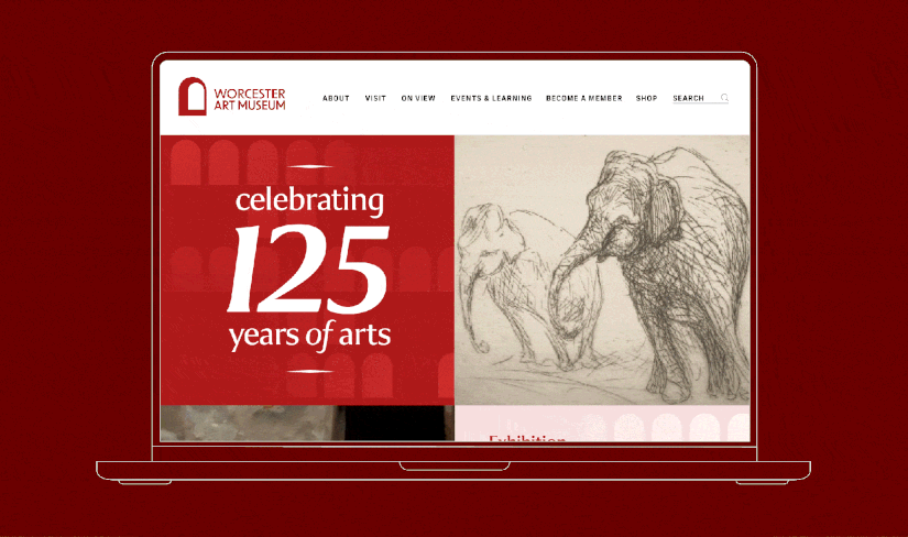
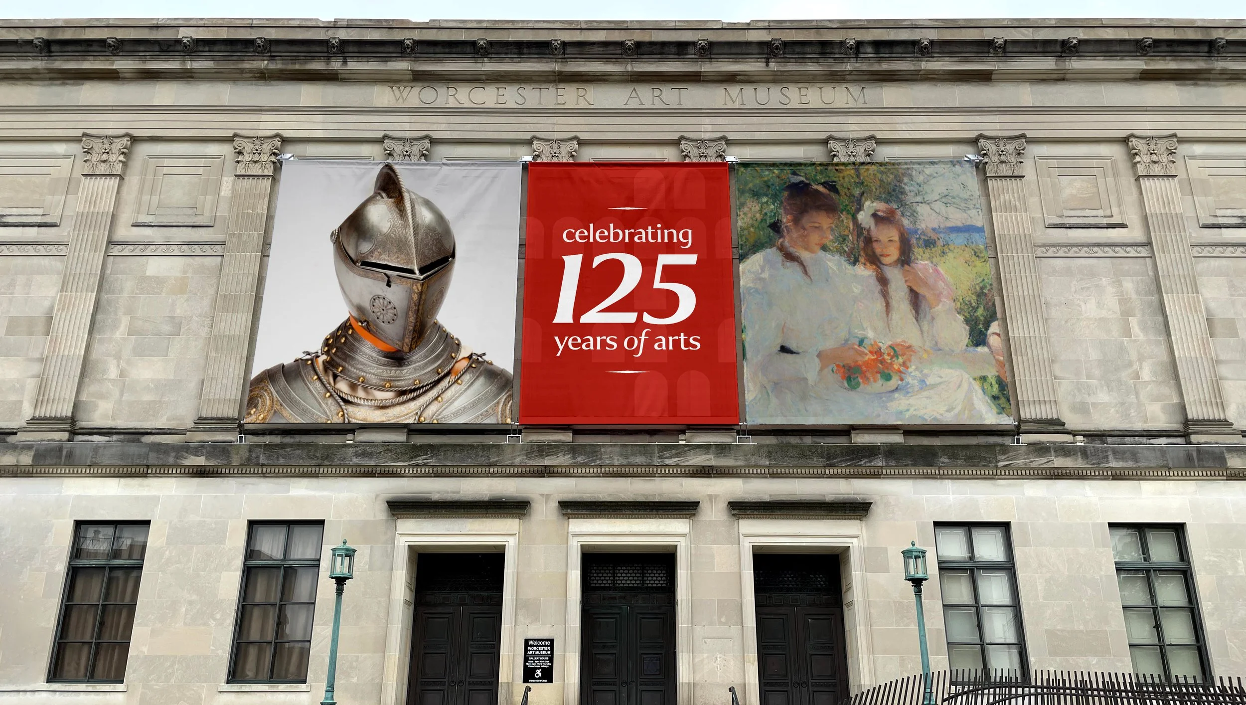
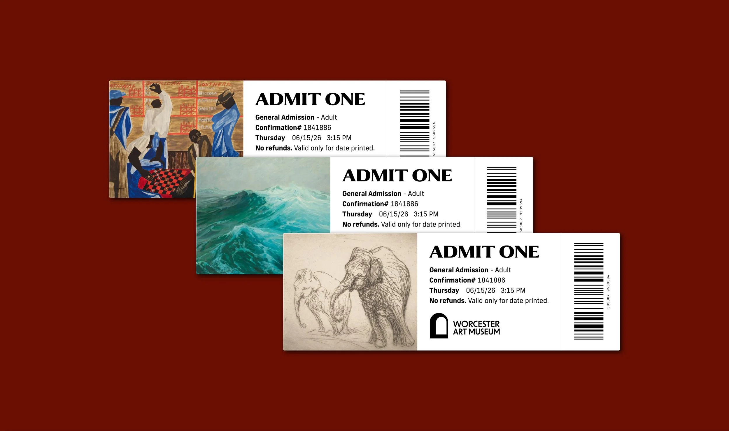
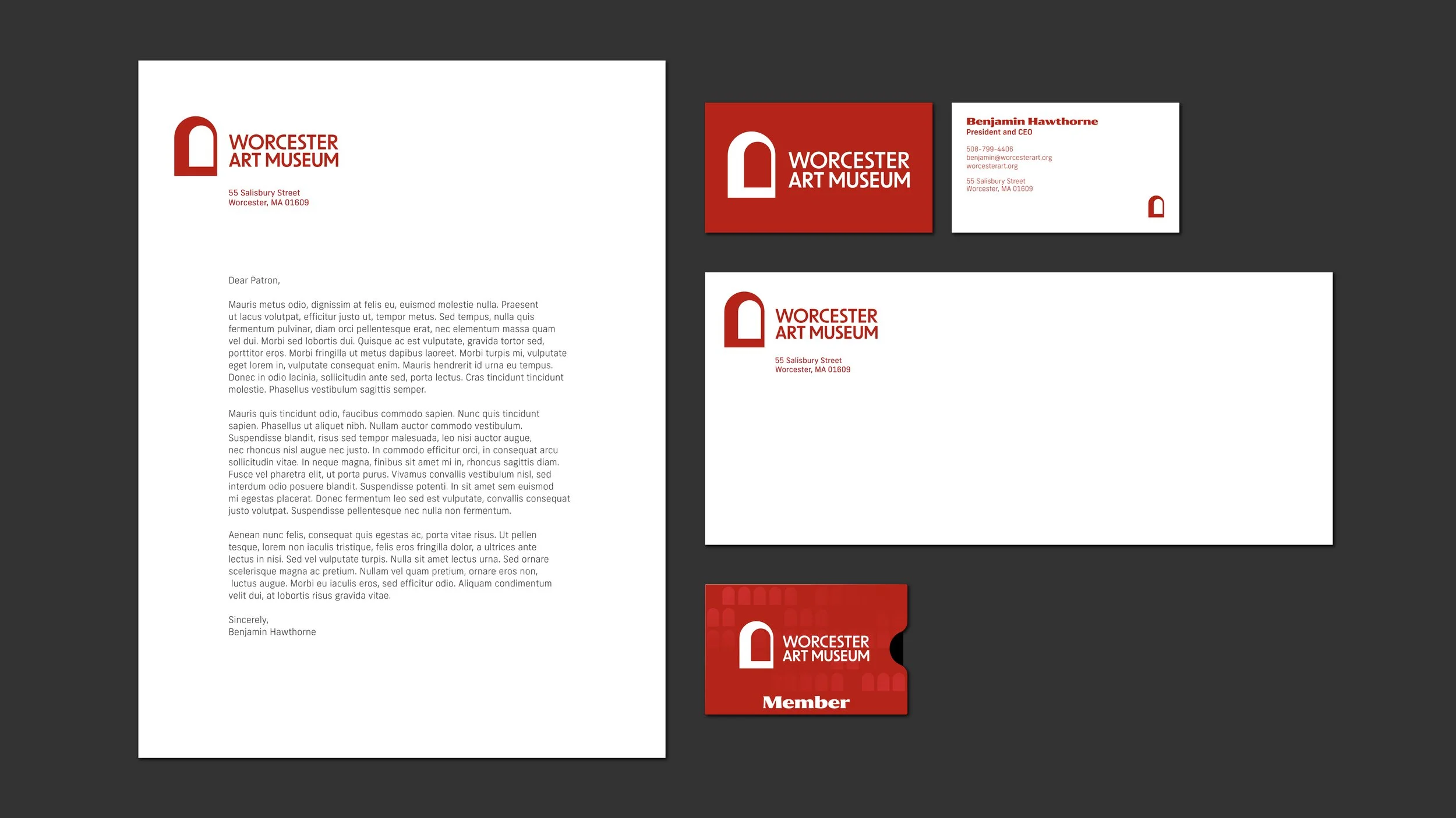
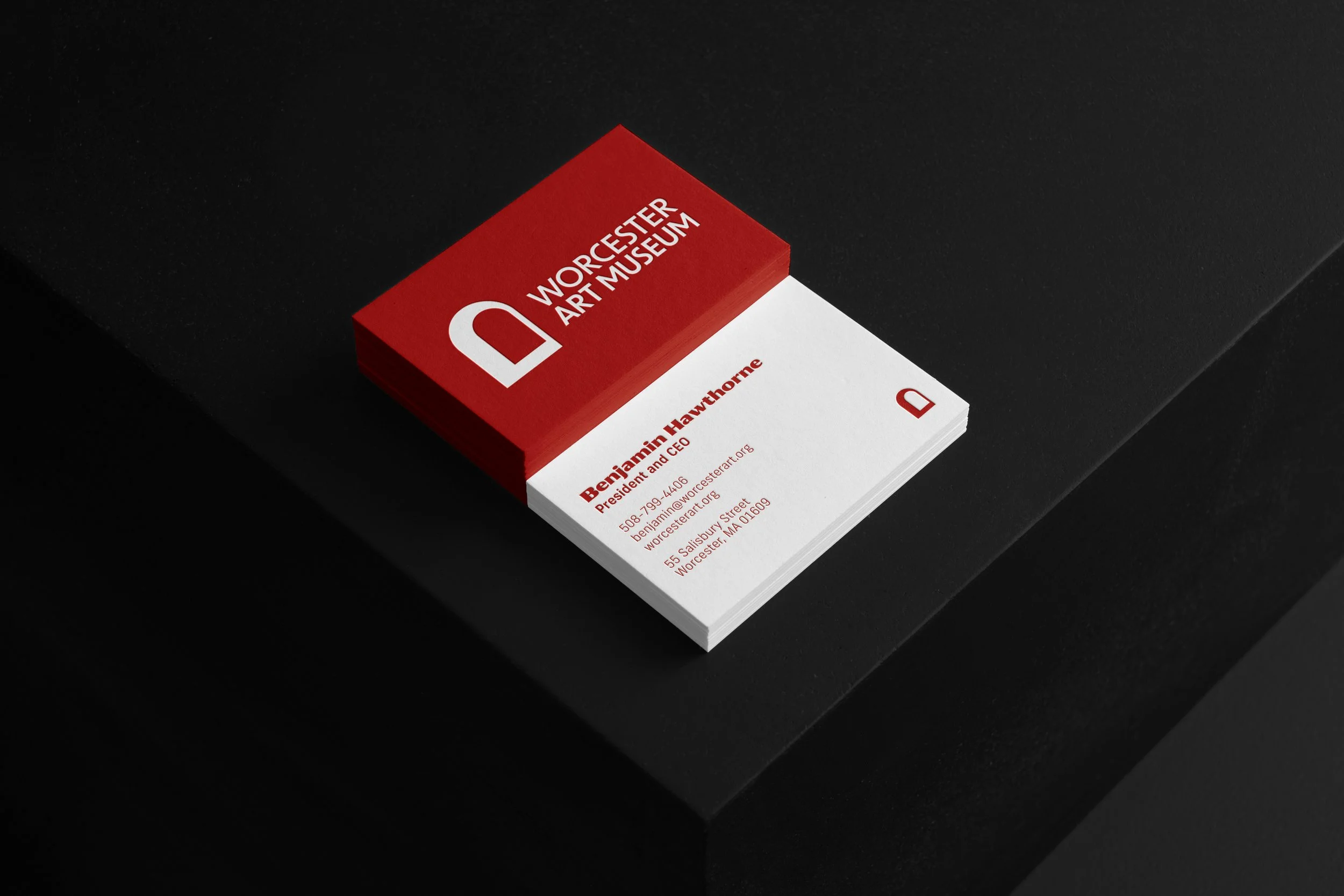
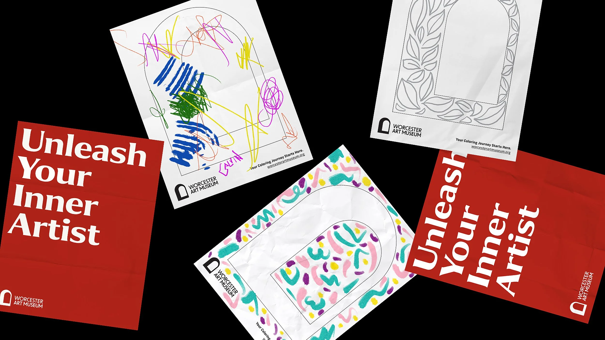
I created a brand identity for the Worcester Art Museum that combines its rich history with a modern, approachable feel. Drawing inspiration from the museum's distinctive architecture and diverse art collection, I developed a sleek, timeless design with a refined color palette and clean typography. This versatile identity works seamlessly across digital, print, and physical spaces, encouraging visitors to engage with art in an accessible and engaging way.

I took inspiration from the architectural arches in the museum and created a symbol that represents entering a unique art space. I also used the arch shape as a background pattern to convey movement.

I selected the Collier font for its bold and versatile display with minimal serifs, conveying an early twentieth-century flair. This contrasts with the New Frank font, which is a tall condensed font suitable for body copy and captions.

I designed the iconography to mirror the thick and thin shapes of the archway symbol.

I wanted to showcase the signature logo in various creative ways on apparel and other key shop items.

Previous
Previous

Brand Alphabet

Next
Next

Caasi